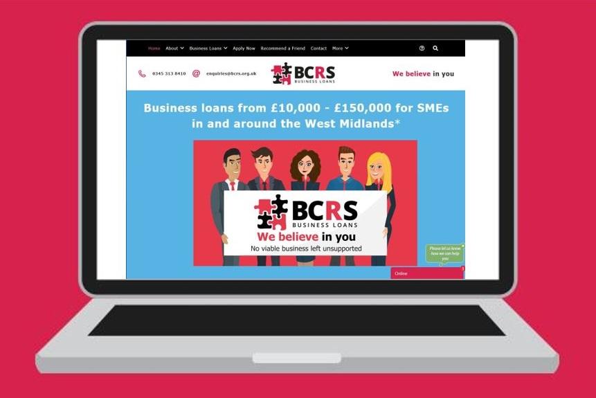
Welcome back to the BCRS blog! Now you’re settled back at work and well into January I’m here to give you some tips on what to include in webpage design to best capture the attention of your audience. There’s a fair few important elements to create the ‘best’ website so I’ll spread them over two weeks, so I don’t bore you too much. I’m hoping I don’t anyway!
General design
The general design for your website should be inviting and colourful for your audience to see. Start by choosing specific colours for your brand. For example; we use black, blue, green, pink, purple and yellow (Very specific shades of each may I add).
Using clashing colours (opposite colours on the colour wheel) on all your web pages will bring specific items to the readers’ attention. (See the colour wheel for a rough guide)
Create ‘short bursts’ of text so your audience stays engaged. Keep to the point, don’t go off on a tangent. This can be very easy to do as an enthusiastic marketer or business owner but always keep your audiences’ perspective at the front of your thoughts. Is the content something you would like to read about on a website? If not, then maybe it’s not relevant at this moment in time.
Navigation
![]()
Navigation is one of the most important elements of your website. If your ‘customer journey’ doesn’t flow seamlessly then the likelihood is that your customer will leave your site very quickly and not make a purchase/enquiry. In worst case scenario they will find a competitor that provides a better user experience, and no-one wants that!
The easiest way to ‘navigate’ your customer it to use a navigation bar. This is a ‘bar’ that appears at the top of a website giving menu options for the user to select various pages on your website. (See image above). However, it’s important that you also don’t make your navigation bar too long. Use drop-down boxes to improve your user experience.
 Also use ‘Call-to-Action’ buttons on each page to give your visitors options to navigate through your website seamlessly. For example: have a button linking to your ‘About us’ page on your home page so visitors have the option to carry on the journey if they wish. It is important to also have an ‘apply now’ button on every page (or at least your most important ones).
Homepage
The first thing your customer sees is your homepage, if your homepage isn’t up-to-scratch then you might as well forget about the design of the rest of your website. Sounds harsh I know but its true.
The most important thing to remember here is DO NOT SELL!! Do not display your sales/ enquiry page on your homepage. It is likely that your customer is going to want to find out more about your business before deciding to buy/ enquire so seeing this as soon as they land on your website will deter them straight away.
Having said this, ensure that the purpose of your business is clear as soon as they land on your website for example ours is : ‘Business loans from £10,000 – £150,000 to SMEs in and around the West Midlands’- this makes it instantly clear to the reader why we are here and what we do.
Don’t be afraid to make your customers scroll down your homepage. Create three to five sections to capture your readers attention and give them an overview of what you offer (you can go into more detail on other web pages later)
Some examples of what to include are:
1- Intro Video- This is a good way to capture your audiences’ attention from the beginning a short video displaying an overview of your business will be a beneficial starting point. You can see ours here: https://bcrs.org.uk/
2- About us – just a small snippet of your business and what you do with an option to find out more like the Call-to-action button displayed earlier on in this post.
3- Testimonials- this is a good way to build customers’ trust in your brand. Display your most recent Trustpilot reviews on your page.
4- Case Studies/Success Stories- These are also a good way to build the trust of your audience, seeing ‘real people’ you have supported. We don’t have this on our home page we have a whole page dedicated to our success stories but that’s just personal preference.
5- Contact information- ALWAYS give your customers the option to contact you at any point in their journey through your website. This information is at the bottom of our home page but we also have a ‘contact bar’ that is always displayed at the top just like our navigation bar. This includes our phone number and email address.
That’s it from me for now, I’ll leave you to investigate these items on your website and make amendments if any before moving on. Don’t forget to come back next week (Wednesday 12pm) for more tips to make your website more appealing and user friendly.
Remember always look at it from an audience perspective, if you think it’s too complicated so will they!
Don’t miss another blog post follow us on social media!
![]() Published by – Lauren McGowan – Digital Marketing Assistant
Published by – Lauren McGowan – Digital Marketing Assistant


